Sports Analytics... if you are a sporting fanatic and Data Science geek like me, then it's the ultimate combination !!
 I have a massive interest in how you can apply analytics in a Sporting environment, in particular football/soccer. I am an FA level 2 qualified football coach having managed youth teams when my two sons played a few years back. I have also played the game for many years (although now retired unfortunately), and I have supported Northampton Town FC (the Cobblers!!) since my early childhood. So what better way to help progress my Data Science learning path, than to mix it with Sport. Even better, how about trying to gain some insights from data, on why my beloved Cobblers were relegated from League One last season.
Whilst researching analytics within the Soccer domain, and specifically that of match related event data, I have been continually frustrated by how difficult it seems to be, getting hold of this type of dataset. There does not appear to be much that is freely available. To clarify what I mean by "event data", it is key events that occur in a football match, for example corners, free kicks, goals, goal attempts etc.
I therefore decided to build a dataset for myself, and at the same time learn a skill often used in Data Science, that of "web scraping". This skill provides the ability to scan or "scrape" a website and pick up items of data from it, which can then be used to build a dataset.
As mentioned previously, I am a true "Cobblers" fan, supporting Northampton Town who have spent most of their footballing history in the basement divisions. The dataset I therefore wanted to build was one containing event data from all of the Cobblers matches in their 2017/18 League One campaign. A campaign which unfortunately did not go very well, and I wanted to find out if the data could tell me why.
To create the dataset and perform the analysis, I have written the following scripts :-
- 1. Web Scraping + Dataset Creation Script :- utilising R and the package RVEST for web scraping
- 2. Data Analysis Script :- using Python (Jupyter Notebook)
- 3. R / Shiny Dashboard :- This provides an interactive dashboard, analysing the datasets produced.
The scripts, together with dataset source files, and various visualisations can be found in my github repository here.
 Web Scraping / Dataset creation Script
- Written using R.
- The web scraping utilised the RVEST package.
- Sports website that was scraped was the Sporting Life site. See here for an example match report.
- CSV Dataset files were created to then be used in further analysis.
Data Analysis Script
- Written using Python (jupyter notebook).
- Uses the dataset files produced by the R script above.
- The script performs basic exploratory data analysis, and creates visualisations using the python package Seaborn.
R / Shiny Dashboard A interactive dashboard for analysing the dataset files.
For the link to the shiny dashboard, click here.
Diagram 1 :- Heatmap (from R Shiny App): Event Types per Match Period (Away matches)
*Match Period = 15 minute segments within a match, added on time in each half also counted as a period.
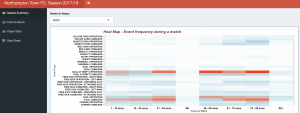
Diagram 2 :- Heatmap (from R Shiny App):Event Types per Match Period (Home matches)
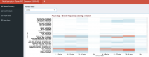
Diagram 3 :- Heatmap (from iPython notebook): Event Types per Match Period (Home + Away)
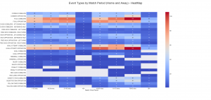
So what do these heatmaps tell us ? ....
- Goal attempts by the opposition happen most frequently in the 76th - 90th minutes of a game, ie. the latter stages of a game.
- Goal attempts by the opposition, are also frequent (compared to other periods of the game), either side of half time (ie. 31st to 45th minute, and 46th to 60th minute).
- Most number of goals conceeded between 46th and 75th minute.
- Away from home (see diagram 1), the Cobblers are committing fouls heavily towards the end of each half, with the 46th to 60th minute period when they are least likely to do so. At Home, it is a similar situation, except the period when they are least likely to commit fouls is at the beginning of matches, 1st to 15th minute.
These insights would seem to suggest that Northampton Town were more vulnerable towards the end of each half. Goal attempts by the opposition were more frequent in these periods, as well as fouls committed.
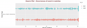
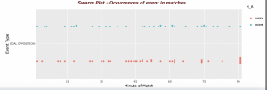
The next diagram also seems to back up the suggested "end of half vulnerability". The Swarm Plot in diagram 3, visually shows the spread of goal attempts by the opposition, within each minute, as opposed to 15 minute periods. Again it can be seen that around half time and full time, there are more attempts on goal by opposition teams.
Diagram 3 : Swarm Plot - Event Occurrences (Goal Attempts by Opposition)
Now taking the analysis a bit further, and looking at actual goals scored by the opposition. If we look at another swarm plot for opposition goals, we see the result in Diagram 4. Away from home, there is a clear spread of goals scored by the opposition, around half time, at the end of the game and into added on time. The pattern however, is not so strong at home.
Diagram 4 : Swarm Plot - Event Occurrences (Goals by Opposition)
For more analysis, go to my github repository, and take a look at the notebook, or play around with the Shiny App for interactive visualisations.
See also R-Bloggers a great website with R content, that has helped me a lot with understanding R.


Nice work Neil!! Great analysis. You’ve clearly made your transition to data science, and it’s paying off with your skills.